
Create eye-catching juice bottle labels for your event. From custom designs to our design service, find inspiration for your branded drinks.
What’s the most important part of a branded juice bottle? The juice itself? The way you display it? Both matter, but it’s often the label design that changes a simple drink into something that gets everyone talking. Let’s explore how to make yours shine.
Whether you’re planning a product launch, exhibition stand or company event, getting your label right can turn your refreshments into a new and memorable experience. From Adobe’s QR-enhanced bottles to Origins’ perfectly matched range, we’ve seen how clever label design can create a buzz at any event.
Label design essentials
First things first – let’s talk about what makes a great label design. While you’ve got complete creative freedom to make your label your own, there are a few key elements that you need to include to keep everything above board:
The must-haves:
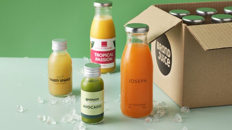
- Bottle size (60ml, 100ml or 250ml)
- Storage information (store below 5°C and drink immediately)
- Production details (“Handmade in LS28 5LY by Brand Juice” or “Juices produced on behalf of [your company name] in LS28 5LY”)
- Full ingredients list
- Allergen information (our kitchen handles oats, nuts and other known allergens)
We also recommend including:
- ‘Shake well before opening’
- ‘Please recycle after use’
Don’t let this dampen your creativity though – these elements can be worked into any design. From minimalist layouts to bold, full-coverage labels, finding the perfect balance between practical and eye-catching ensures your juices stand out.
The power of colour
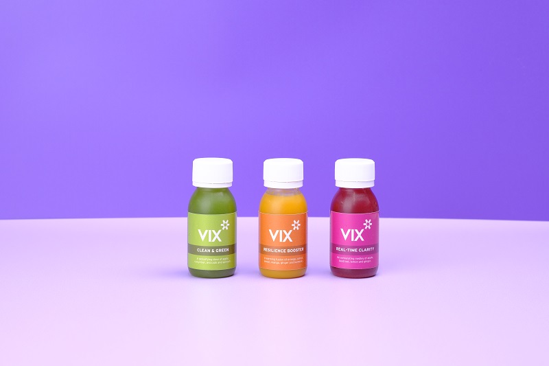
When it comes to making your label stand out, colour is your secret weapon. You can either match your label to your juice for a seamless look or create contrast for added pop. Both approaches work brilliantly, it’s about finding what works for your brand.
Match or contrast?
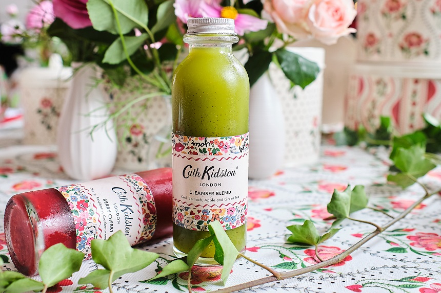
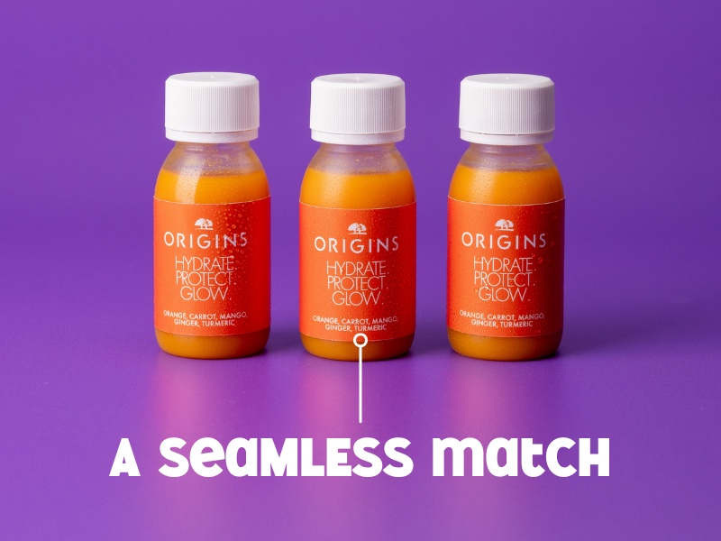
Take Origins’ ‘Hydrate, Protect, Glow’ range. Their orange juice features warm coral labels that complement the drink perfectly and mimic the packaging of the product range they are promoting. It creates a harmonious overall look that works well for their natural, wellness-focused brand. Matching your label colour to your juice colour precisely can be difficult, but colour matched labels do work nicely to create a drenched effect even without an exact match.
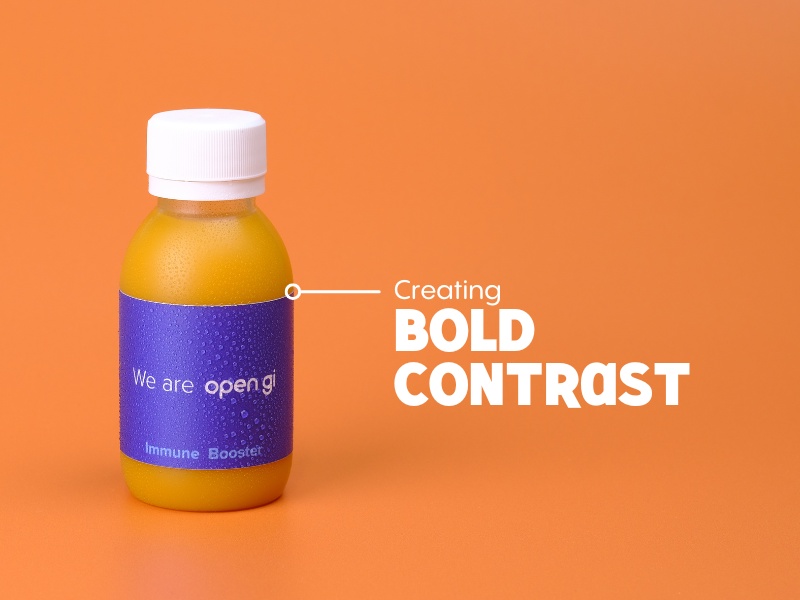
On the other hand, using contrasting colours for the juice and label also works fabulously. We recommend looking at the colour wheel to find colours that give you the best eye-catching contrast. For example, a vibrant orange juice creates a striking contrast that makes a distinctive blue label really sing.
A note about blue branding
Most brand colours can be easily matched to our range of vibrant juices. The one colour that’s a bit tricky is blue, because there are very few combinations of natural ingredients that produce an appealing-looking blue juice. We always recommend that clients who have a blue brand or campaign to promote use a blue label on a contrasting-coloured juice, such as green, yellow or red.
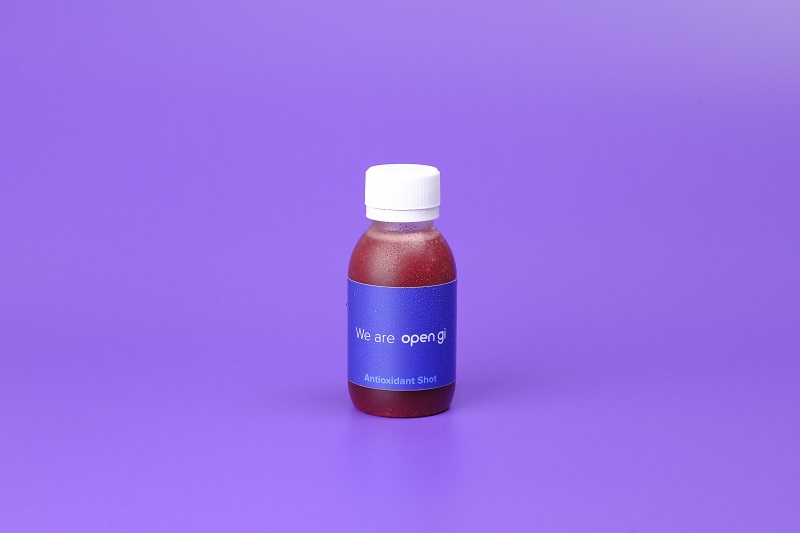
You can see that the contrasting-coloured juice highlights the blue and makes it pop. This works much better than using a blue juice as you can use your exact brand blue and not compromise on the flavour and appearance of the juice itself.
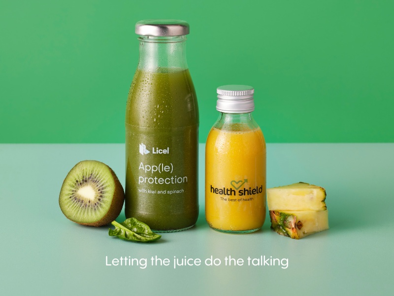
Working with juice colours
When it comes to picking your perfect juice and label combination, we’ve got a rainbow of natural colours to play with:
- Orange, mango and passionfruit gives classic orange warmth
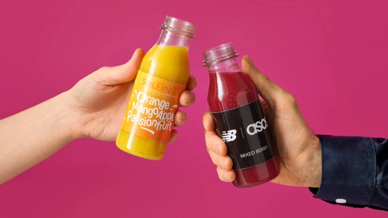
- Mixed berry brings deep, rich purple tones
- Apple, kiwi and spinach offers vibrant green freshness
- Ginger and beetroot creates dramatic deep red
- Orange, banana, lemon and honey gives sunny tropical vibes
Whether you’re working with clear or full-print labels, your juice colour can play a key role in your design, so think carefully about what’s going to work best.
Clear vs full-print labels: which is best for you?
The choice between clear and full-print labels impacts the overall look and feel of your juices. Both options can look fantastic, but one might be better suited to your brand or event.
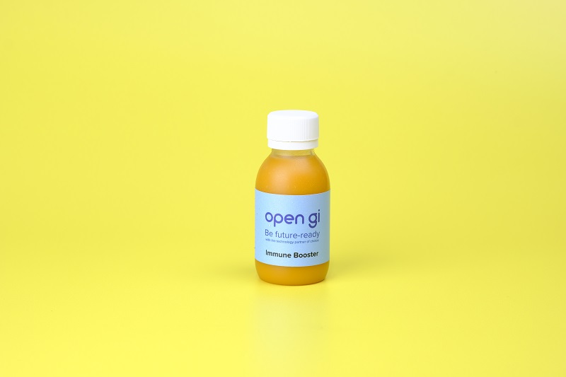
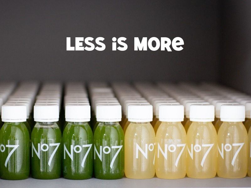
Clear labels are the perfect choice for when you want your juice or a simple name or logo to be the star. They create a clean, minimalist look that works well with vibrant juice colours. While monochrome designs are a popular choice for clear labels – creating a sleek, timeless feel – don’t shy away from playing with colour. Adding a splash of colour, like vibrant accents or colourful graphics, can make a clear label even more striking.
It’s worth noting that text and images on a clear print label need to be in contrasting colours to your juice, as there is no background. For instance, black text on a dark juice will not show up on a clear label, neither will white text on a lighter juice colour.
Take a look at our artwork guidelines for more guidance.
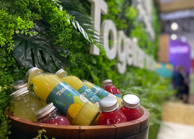
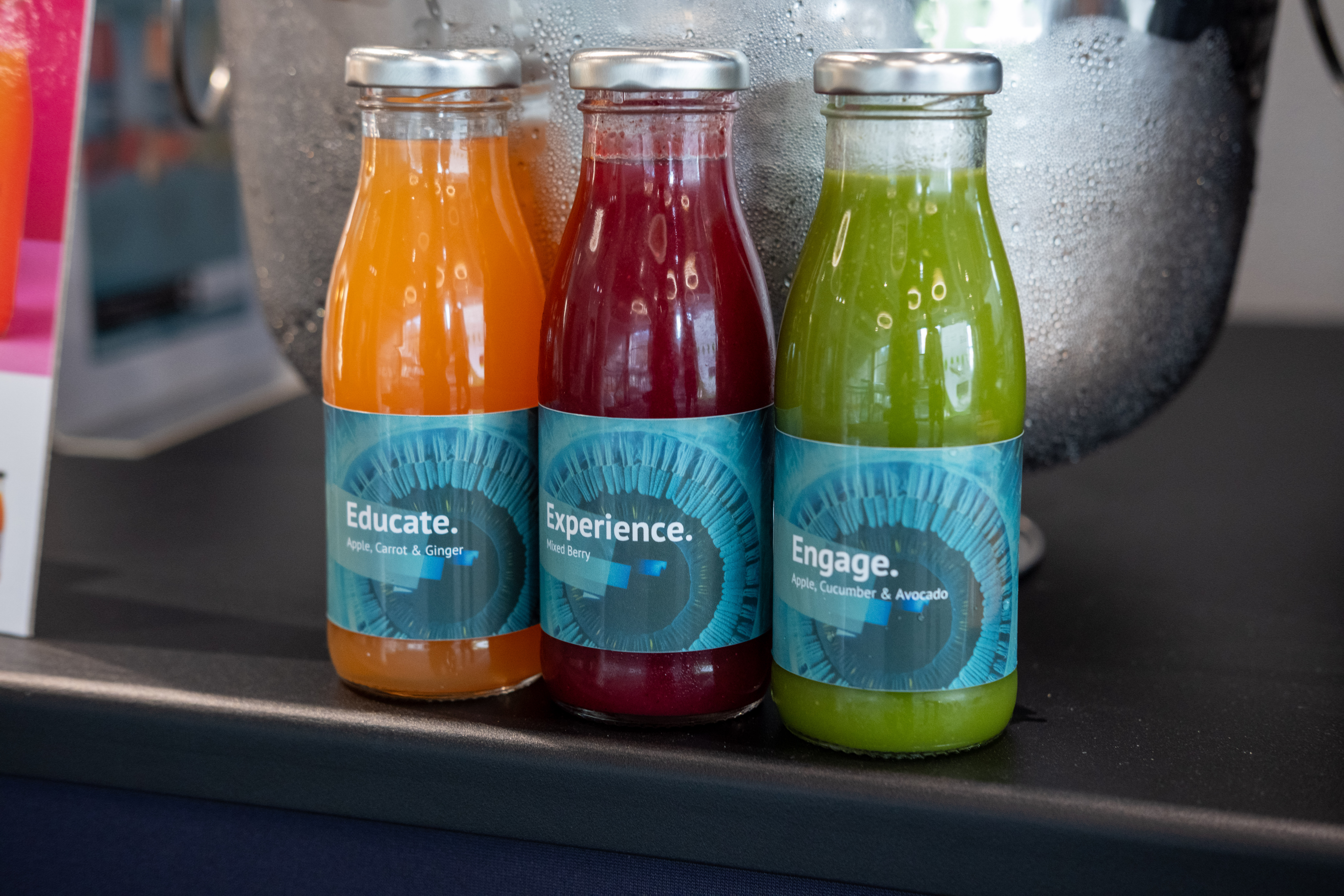
If you’re looking to share a little more information, full-print labels might be the right choice. They provide a blank canvas, with plenty of space to showcase your brand and create striking designs. They work especially well for events or promotions with a defined design concept.
Full-print labels are ideal for creating a design that grabs attention from multiple angles. Whether you’re incorporating eye-catching graphics or emphasising key information, full-print labels give you the flexibility to tell your brand’s story in more detail.
Design approaches
Designing your own labels
For brands who handle their own label artwork, the possibilities are endless. Your label design can do so much more than just show your logo – from driving app downloads to telling your brand story, we’ve seen some fantastic approaches that make a big impact.
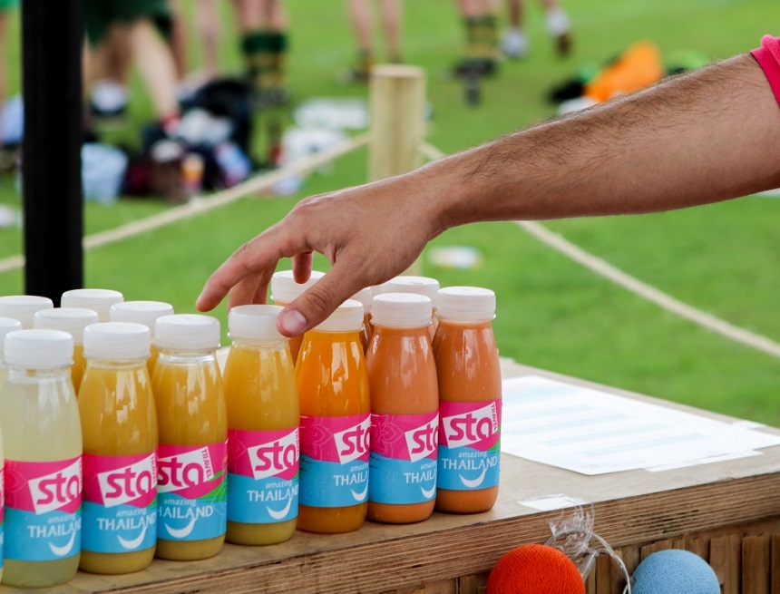
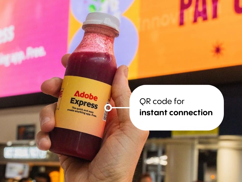
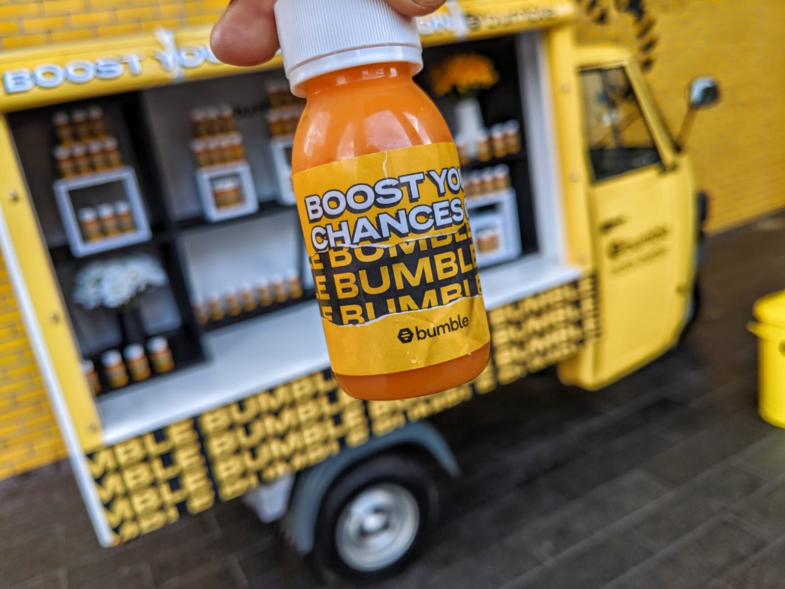
Adobe’s station takeover labels are a great example of making the most of the available space. The label not only featured the attention-grabbing ‘creative juice’ branding but also included QR codes linking straight to an app download. This turned every bottle into an interactive brand experience – shining a light on the new app the event was promoting.
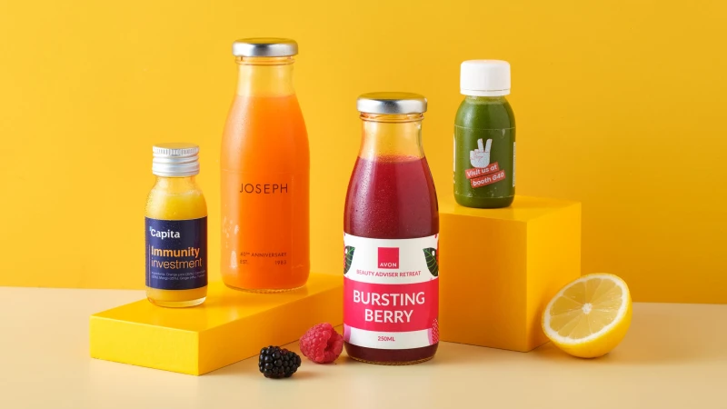
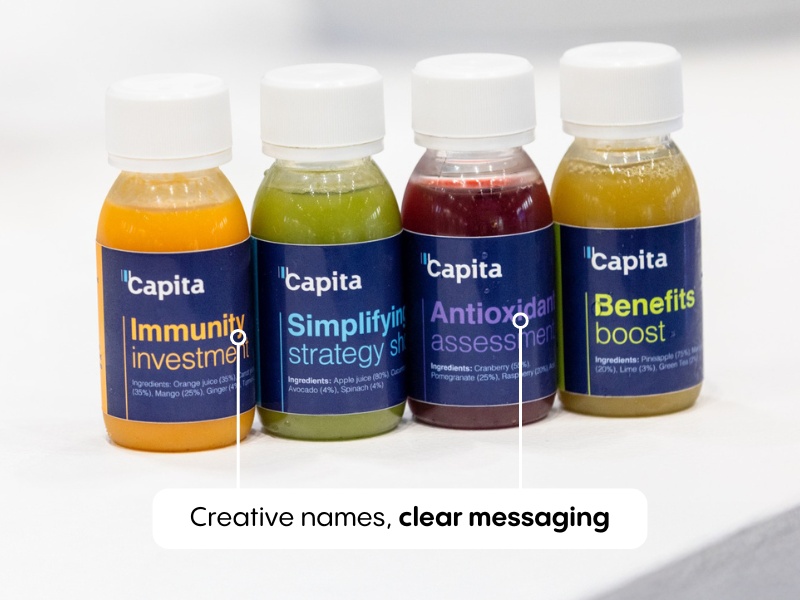
Capita got creative with words, using names like ‘Immunity investment’ and ‘Simplifying strategy’ to make their range unique. Meanwhile, Origins shows how labels can perfectly complement your product range, creating a seamless, upmarket brand experience.
Our label design service
Need your label designed quickly? Whether your in-house design team is facing tight deadlines or you don’t have designers on hand, our label design service keeps things simple. For £75 plus VAT, we’ll create your artwork within one working day.
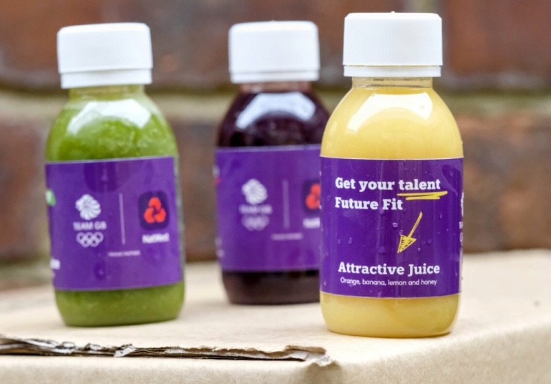
The process is straightforward – choose from our standard layouts, send us your logo and any brand elements like colours and fonts, and we’ll do the rest. The more you provide, the better the result – like NatWest’s design, where bold messaging and clean branding perfectly tied into their brand story.
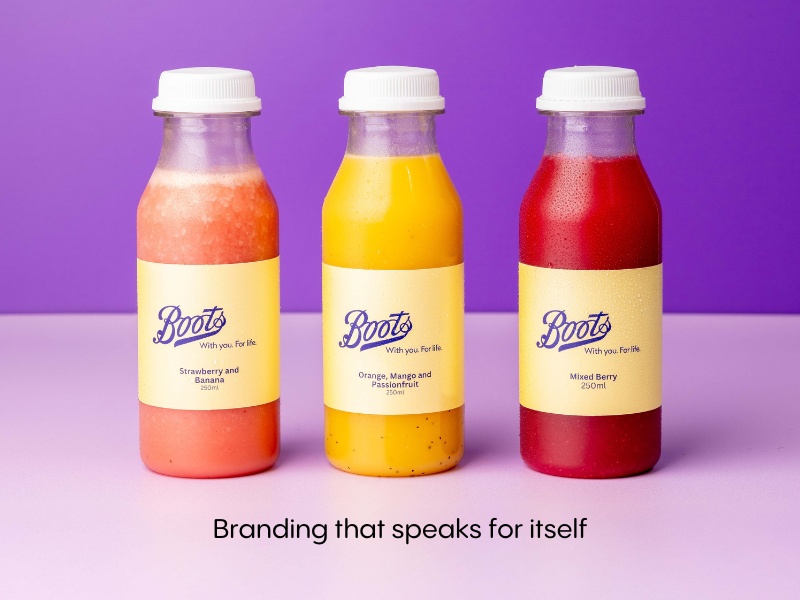
We can still create impactful labels with minimal assets. Take Boots’ design: plain-background labels featuring just their logo and tagline. It’s a simple approach that makes the most of their instantly recognisable logo, letting their brand recognition do all the talking.
Creating your own artwork?
If you’re designing your own labels, here’s everything you need to know to get them print-ready:
60ml Bottles
- Label size: 115mm x 43mm (plus 3mm bleed)
- Maximum logo width: 33mm
100ml Bottles
- Label size: 137mm x 43mm (plus 3mm bleed)
- Maximum logo width: 40mm
250ml Bottles
- Label size: 165mm x 55mm (plus 3mm bleed)
- Maximum logo width: 50mm
For all labels, regardless of size:
- File format: PDF
- Resolution: 300dpi
- Bleed: 3mm
- Safe Area: 3mm
- Colour Profile: CMYK
- Minimum Font Size: 6pt
Design tips
Here are some key things to think about when designing your label:
- Keep it clear and focused – choose one key message rather than crowding your label with information
- Consider your logo size carefully — keep it within the maximum width for your chosen bottle size so it’s fully visible without twisting the bottle (especially important for photos)
- Think about colour matching – while matching label to juice colour can create stunning results, it can be technically challenging and needs careful thought
- Add digital elements – QR codes can turn bottles into interactive touchpoints, perfect for driving engagement
- Test at different distances – make sure your design works both close up for photos and from across the room to grab attention
Timing matters
Remember to include all the mandatory label information we mentioned earlier and get your artwork to us at least two weeks before your delivery day. This gives us time to print your labels and get everything ready for your event, hassle-free.
Your label is a finishing touch that can pack a huge punch. It’s an opportunity to tell your brand’s story, create memorable moments and turn heads. Whether you’ve got a vision ready to go or need a helping hand to pull it all together, we’ll help you make it impactful. Let’s create something unforgettable!
Ready to get started? Whether you’re creating your own design or using our service, we’re here to help your brand shine. Get in touch or build your quote today.